
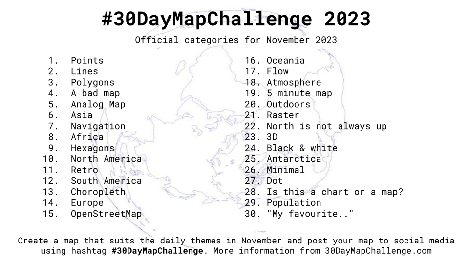
GEOLYTIX and the 30 Day Map Challenge 2023
Daily social mapping project happening every November: https://30daymapchallenge.com/. This is the second year we have joined this as a team, see all our maps here.
1st December 2023 • GeoData
The team created maps based around different daily themes for a social mapping project happening every November. Always great to see what ideas our team and others come up with for the various topics each day.
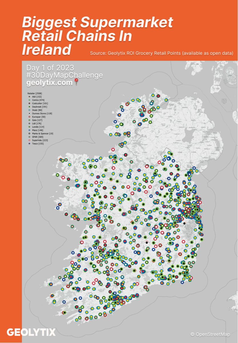
📅 Day 1: Points by Louise Cross
Biggest Supermarket Retail Chains In Ireland
We kicked off the month with not only a map but some open data! You can download the data behind this map here.
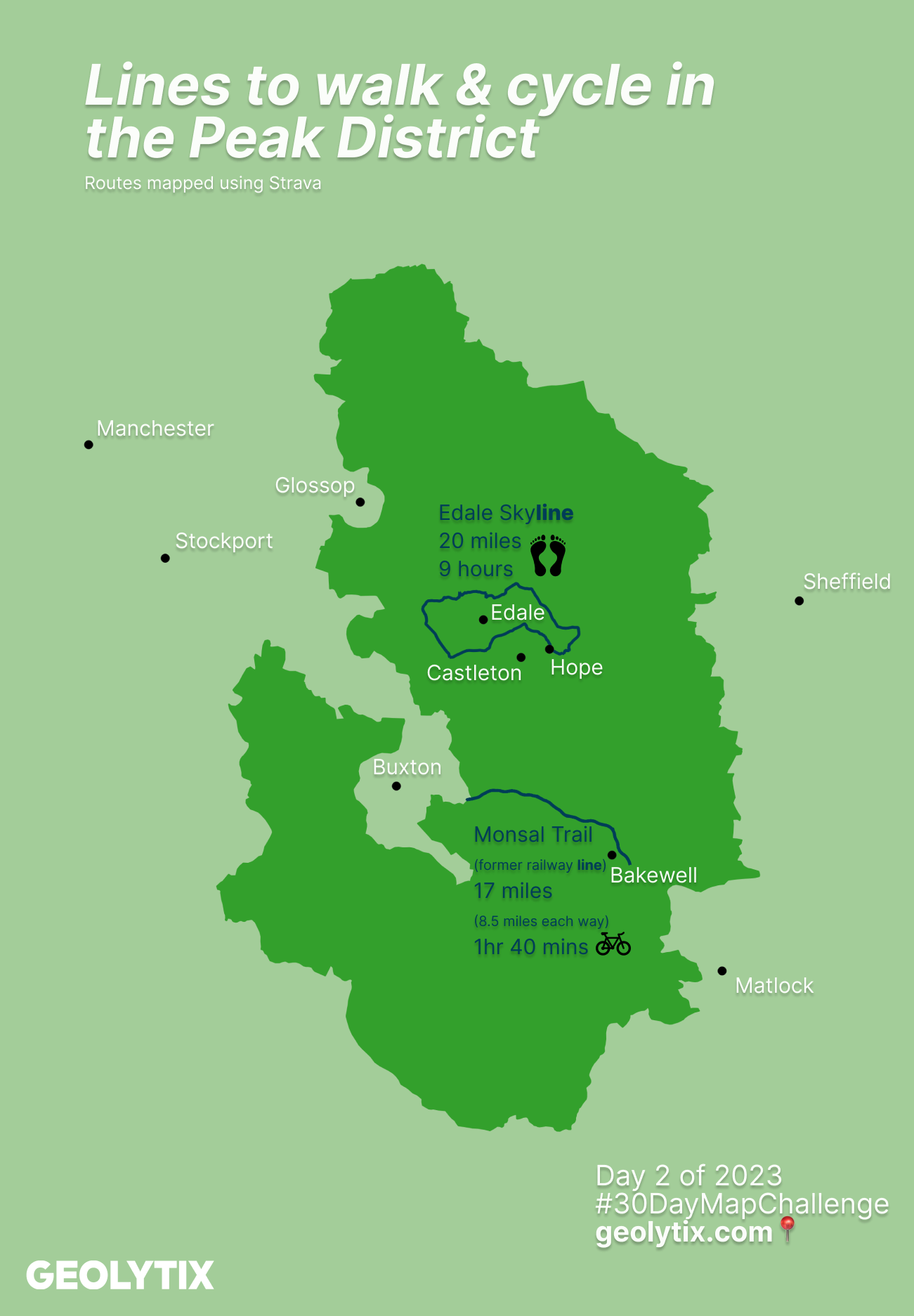
📅 Day 2: Lines by Louise Cross
Lou chose her favourite lines to walk & cycle in the Peak District, any excuse to roll our National Parks data set
👣 Edale Skyline, a beautiful and challenging 20 mile route along the hills and ridges above Edale village.
🚲 Monsal Trail, the route follows the former Manchester to London Midland Railway line which closed in the late 1960s. This is an 8.5 mile long traffic-free route which is enjoyed by walkers, runners, cyclists, wheelchair users and horse riders.
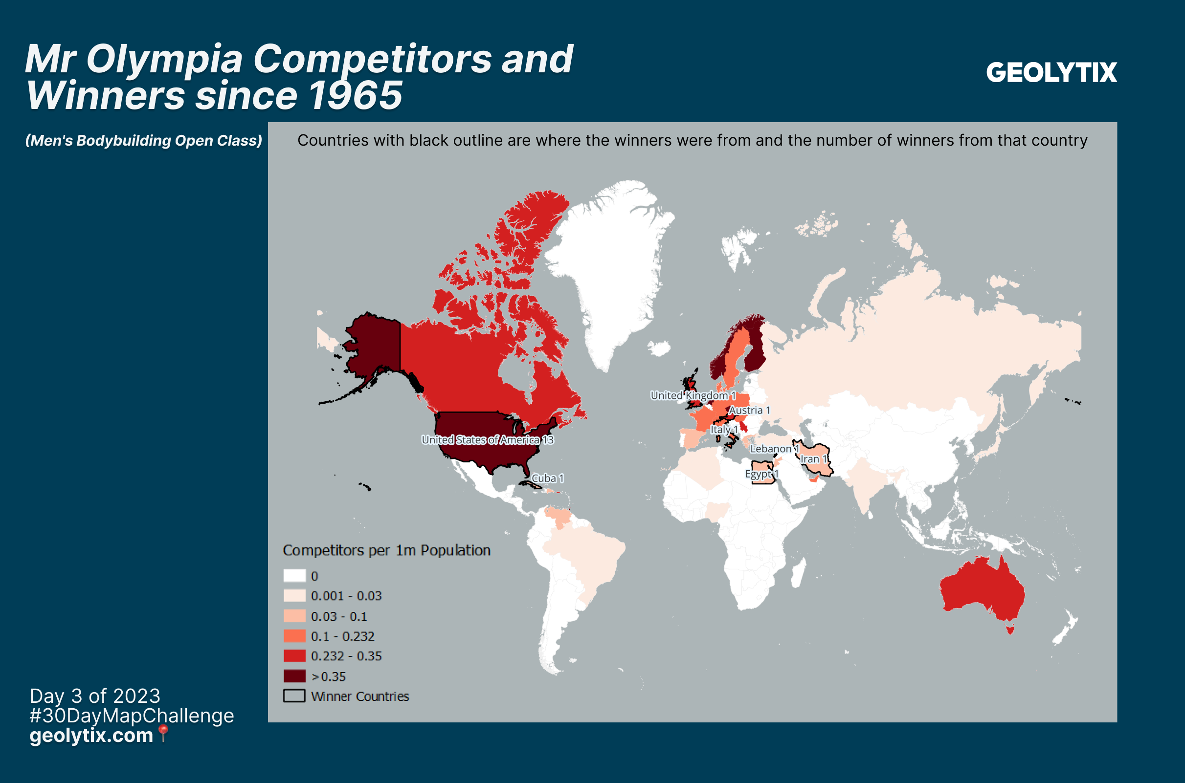
📅 Day 3: Polygons by Khrishina Mistry
Mr Olympia competitors and winners by country since 1965
Mr Olympia is the world's top bodybuilding competition, where the champion is crowned based on having the best overall physique - this is a combination of their conditioning, muscularity, posing, size, symmetry and stage presentation. Arnold Schwarznegger is regarded as one of the greatest bodybuilders of all time, and brought the sport to the masses after winning the Mr Olympia title 7 times between 1970-1980.
The 2023 competition was held at the start of November and to commemorate this, Khrish's map shows where the previous competitors in the men's open class were from (there are several other classes for both men and women). Whilst there have been 58 Mr Olympia competitions since the first in 1965, the open class winners have so far only come from 8 countries.
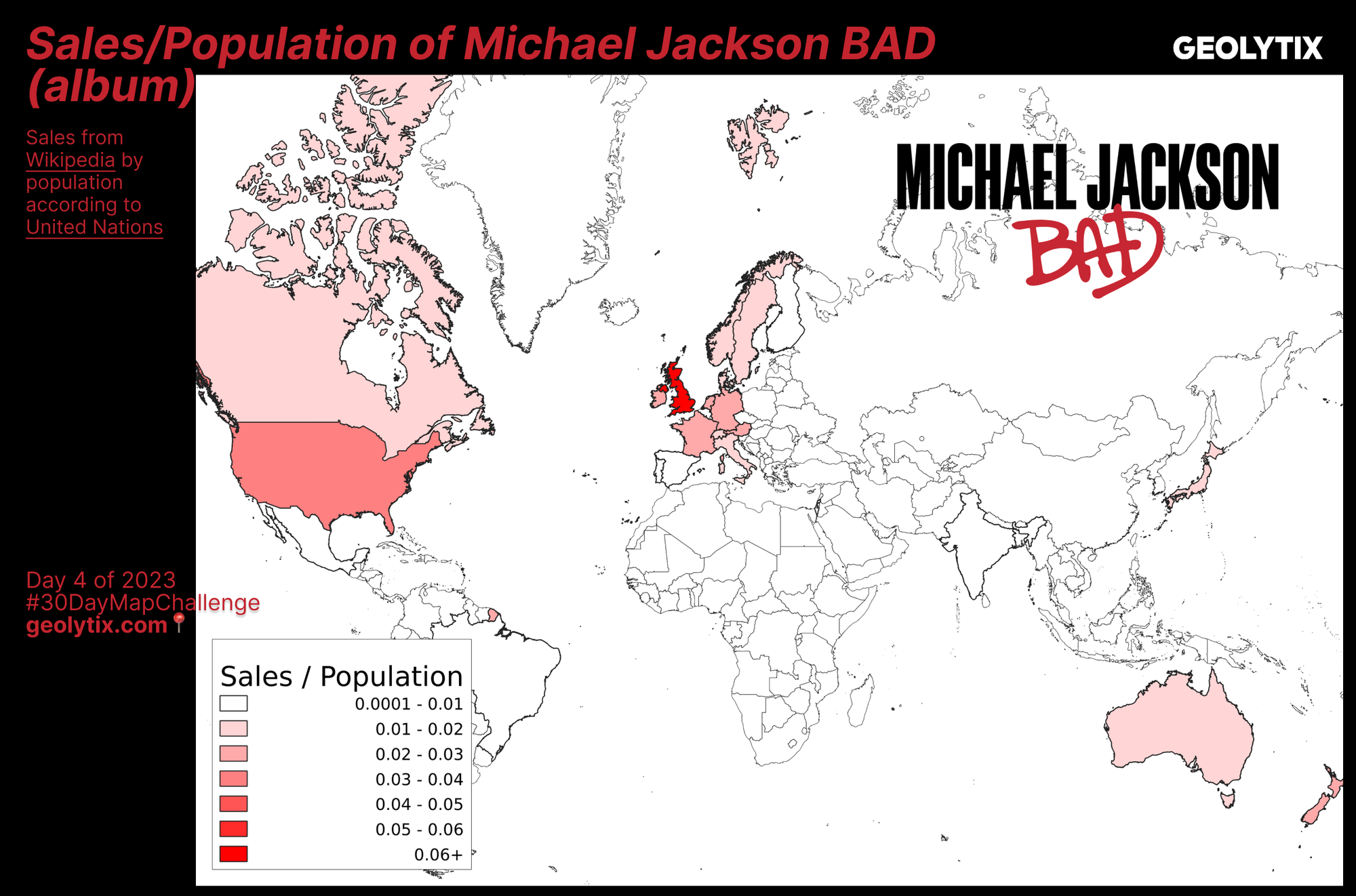
📅 Day 4: A bad map by Dennis Bauszus
Sales/Population of Michael Jackson BAD (album)
Michael Jackson's Bad album was released in 1987, selling over 35 million copies worldwide. Despite selling over 1 million copies in Brazil the size of the population dilutes the sales density. USA, UK, Germany, France, Japan and Italy also each contributed over a million units sold.
🎶 UK comes out top with sales per population, followed by USA, Austria, Ireland, France, Germany, Netherlands & New Zealand.
A controversial character but the "King of Pop's" music broke numerous records globally allowing Dennis to create this Bad map.
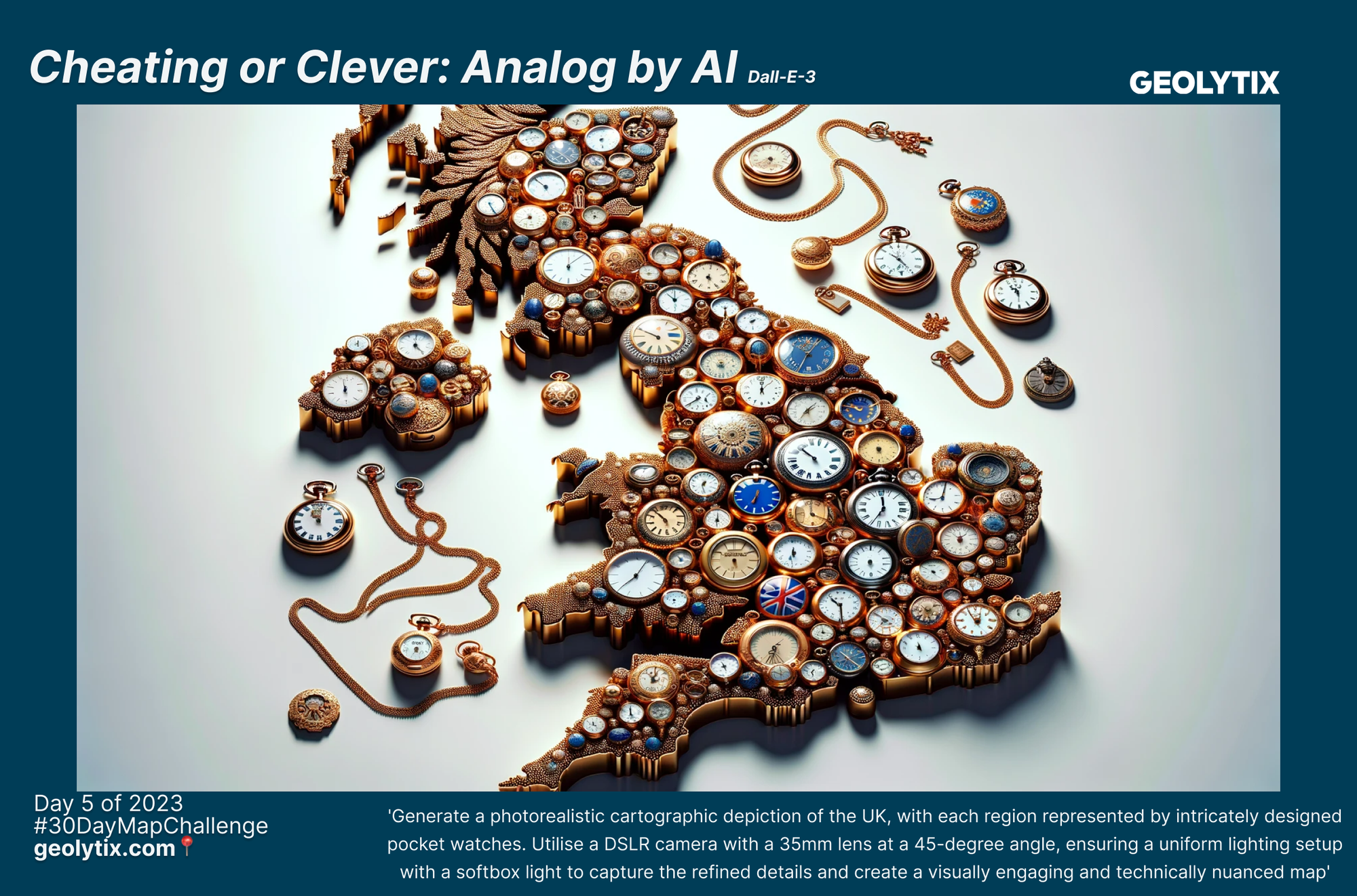
📅 Day 5: Analog Map by Brendon Edwards
Analog by AI
Has Brendon cheated or been clever with this map? Using Dall-E-3 to 'generate a photorealistic cartographic depiction of the UK, with each region represented by intricately designed pocket watches. Utilise a DSLR camera with a 35mm lens at a 45-degree angle, ensuring a uniform lighting setup with a softbox light to capture the refined details and create a visually engaging and technically nuanced map.'
Can't fight the future, we think it looks great!
📅 Day 5: Analog Map by Team Leeds
Just in case our other submission was a bit controversial for non-digital, we have another to balance it out. The brilliant Leeds team recently jazzed up our office with a giant world map sticker. The fun bit, it came in 2 parts which we needed to line up. It took a team effort, thanks Jessica Chapman, Aimee Thomason, Rebecca Mellor, Max Laing & Freddie Wallace, it looks brilliant. Cheered on and documented by chief photographers Wensi Kirkham & Louise Cross.
Markers have also been added for all of our offices across the world:
UK (London & Leeds), South Africa, France, Poland, Italy, China, Japan and Australia. But did they manage to locate the cities without consulting a map?

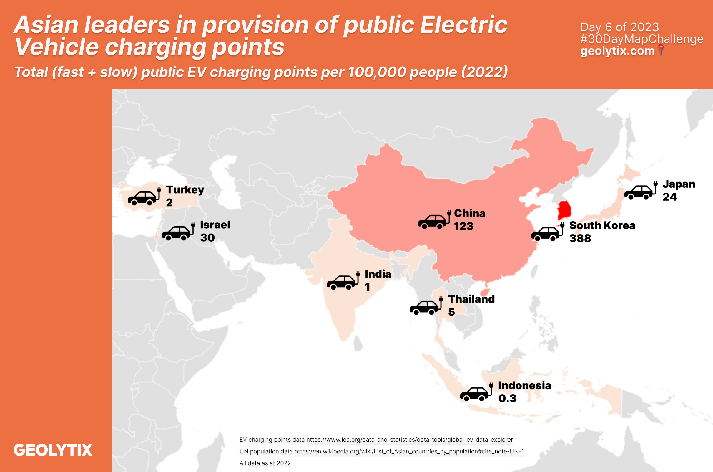
📅 Day 6: Asia by Samantha Colebatch Hodkinson
Asian leaders in provision of public Electric Vehicle charging points
Samantha mapped out provision of public Electric Vehicle charging points per 100,000 people with data sourced from International Energy Agency.
🔌South Korea are leading the way in Asia.
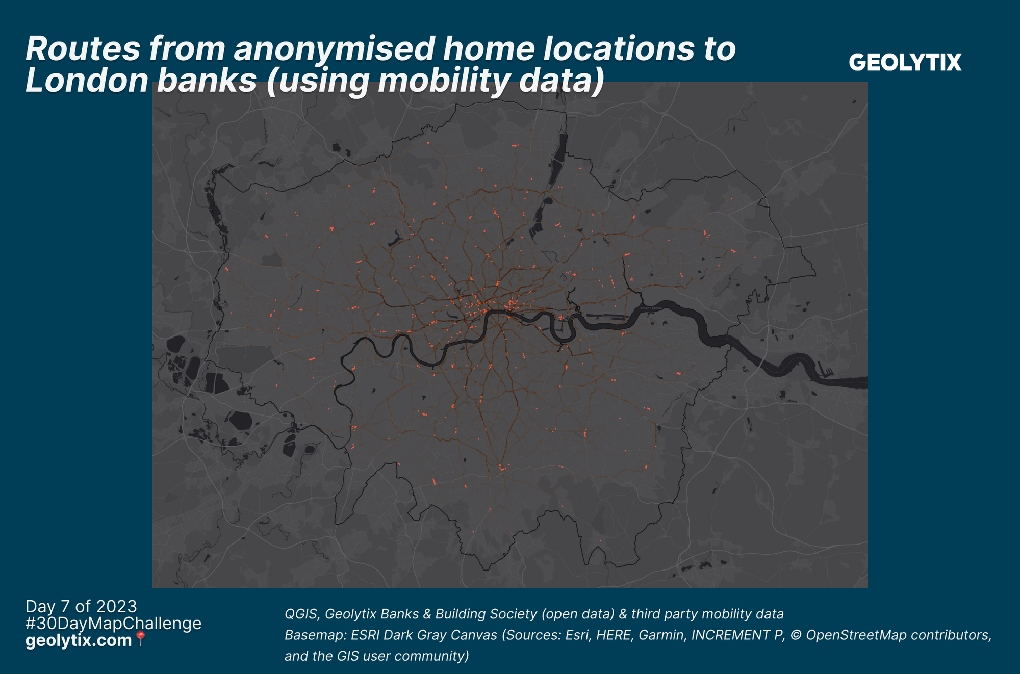
📅 Day 7: Navigation by Alessandro De Martino
Routes from anonymised home locations to London banks (using mobility data)
Alessandro's map for today routes anonymised home locations using third party mobility data to open banks and building societies in the region of London.
⬇️ You can read more and download the bank & building society locations for the full UK in the comments below. We are also testing our Locate powered by GEOLYTIX MAPP instance where you can navigate yourself to your nearest branch operator, give it a go and let us know your feedback.
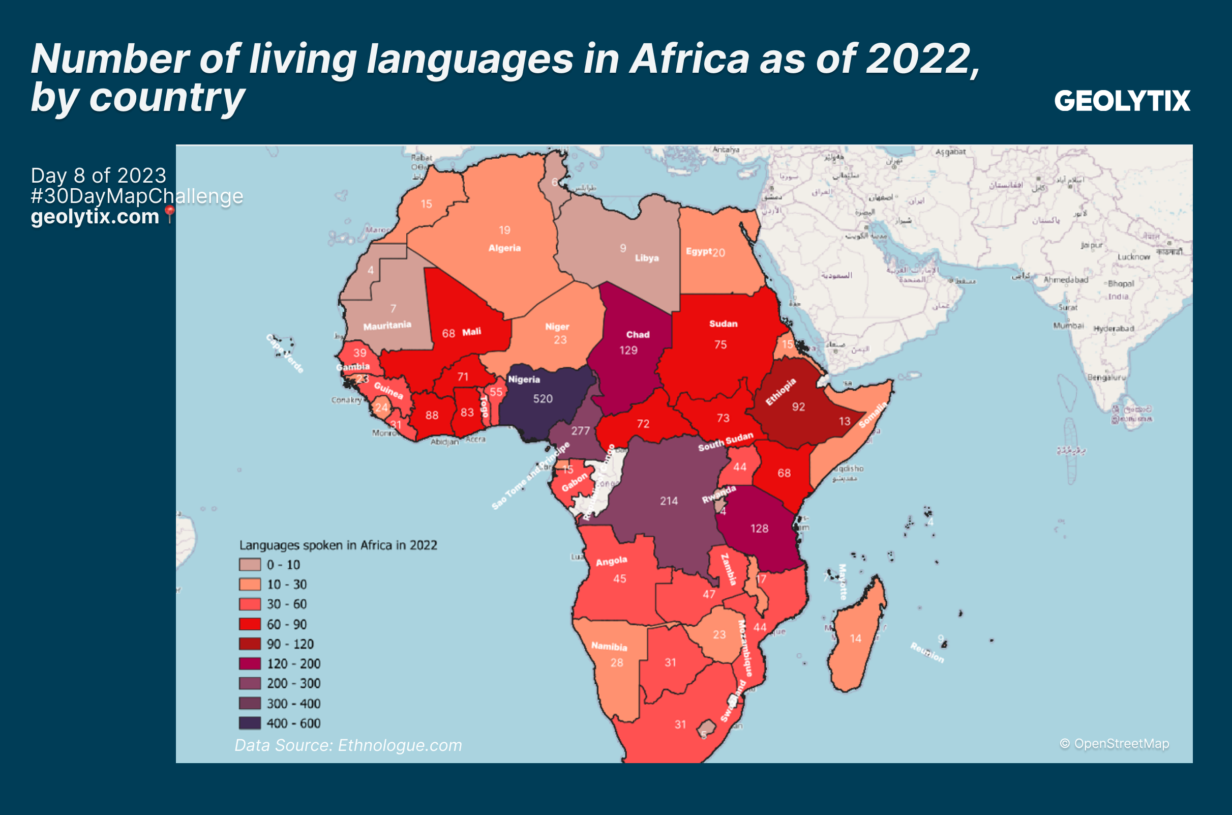
📅 Day 8: Africa by Sonia Traore
Number of living languages in Africa by country, as of 2022
Sonia mapped the number of living languages in Africa (as of 2022) by country. Thousands of languages are spoken across Africa. With a population of over 210 million people, Nigeria has 520 living indigenous languages.
Sonia: "The idea came from a book I’ve read recently called 'Africa is not a country' which tries to break stereotypes of modern Africa and show the diversity of the continent."
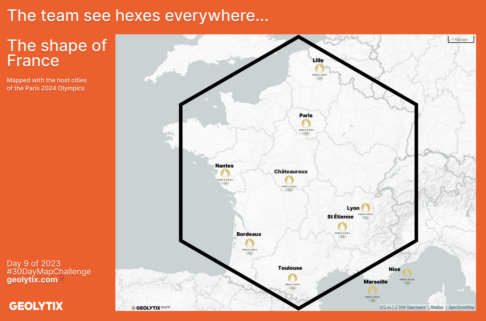
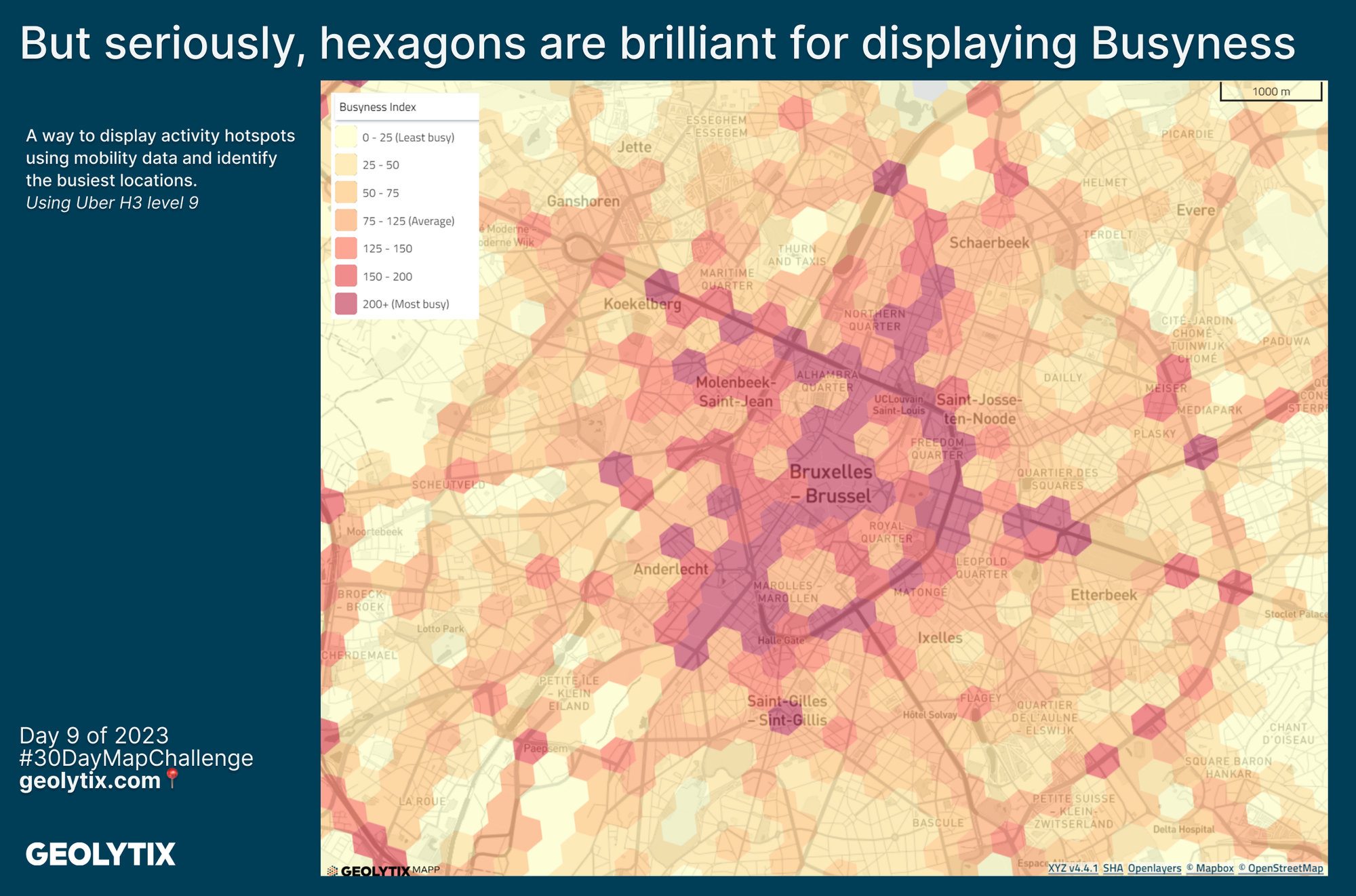
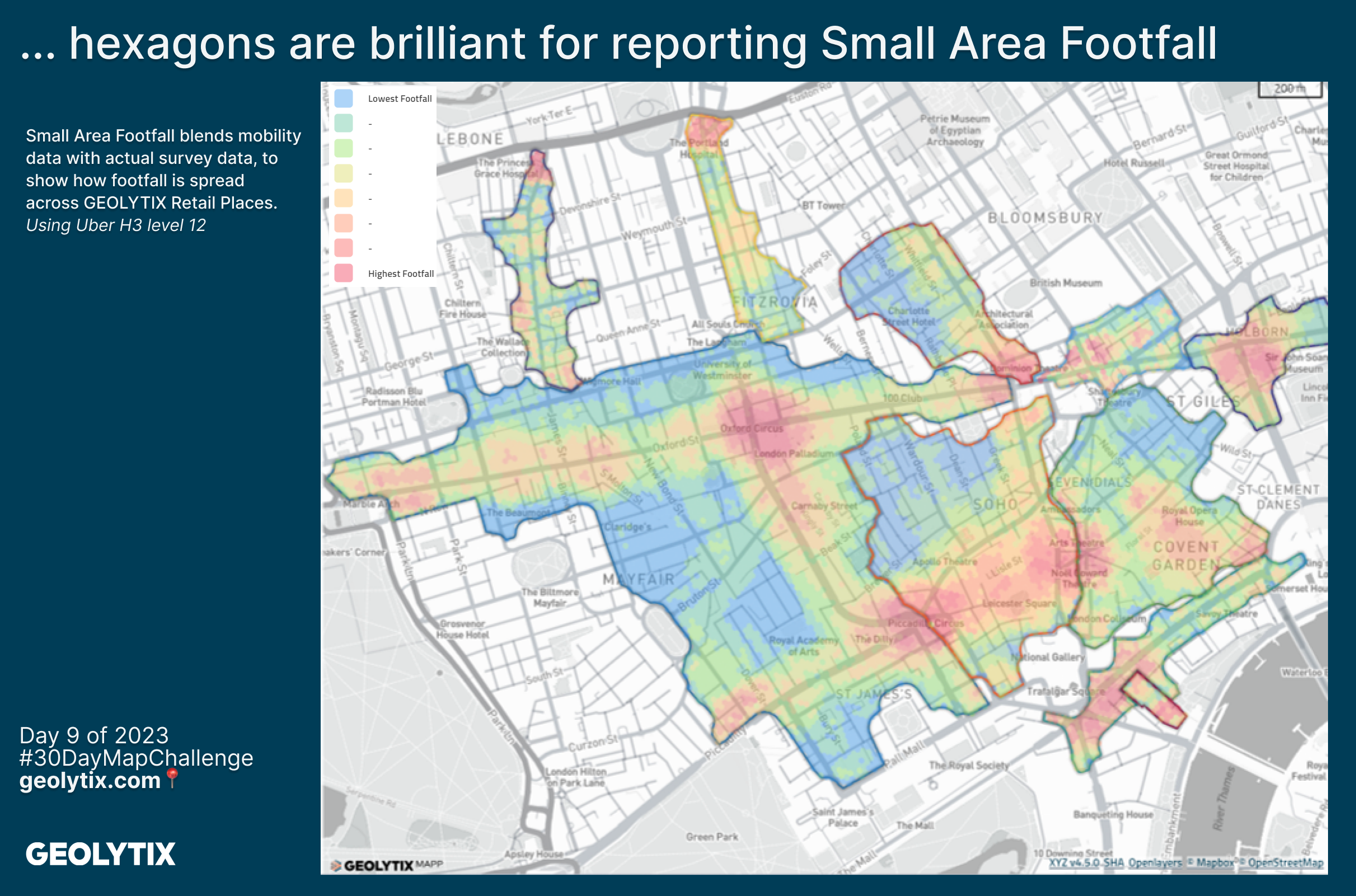
📅 Day 9: Hexagons by Stéphane Martis
The team see hexes everywhere...
Well it's not a secret that our team love a hexagon, they see them everywhere 👀. This map idea stemmed from someone saying France is basically a hexagon so there was only one man for the job... Stéphane.
Paris are hosting the 2024 Summer Olympics & Paralympics, but there are venues all across France, 9 venues within Paris suburbs and 9 outside the Paris region.
This then triggered the idea of what if all countries were hexagons, so in this map you can see the world if all countries were hexes, scaled to the size of the country.
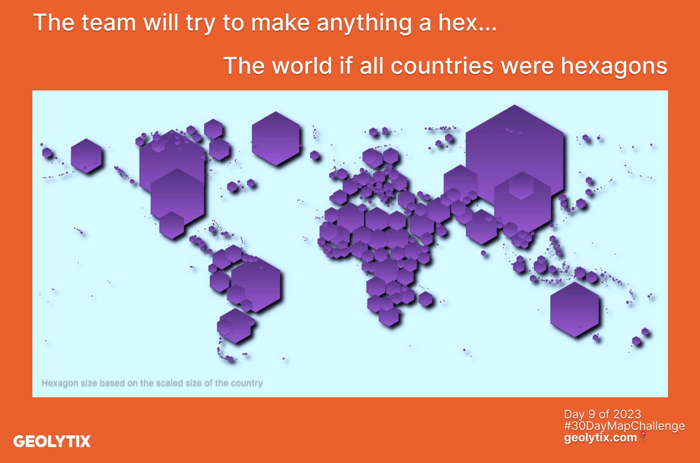
But in all seriousness hexagons are a brilliant shape to display certain data, Uber's H3 grid is widely used across the geospatial industry.
⬡ Datasets at H3 grids enable us to map administrative geography data to consistent hex level.
⬡ H3 grids naturally aggregate upwards for summary statistics at larger geographies and downward to near point level for POI.
⬡ Datasets created at hex level across all markets allows for consistency of data and analysis.
The next two maps show some of our mobility data based data sets which we produce at H3, our International Busyness Index and our UK Small Area Footfall for over 15,000 Retail Places.
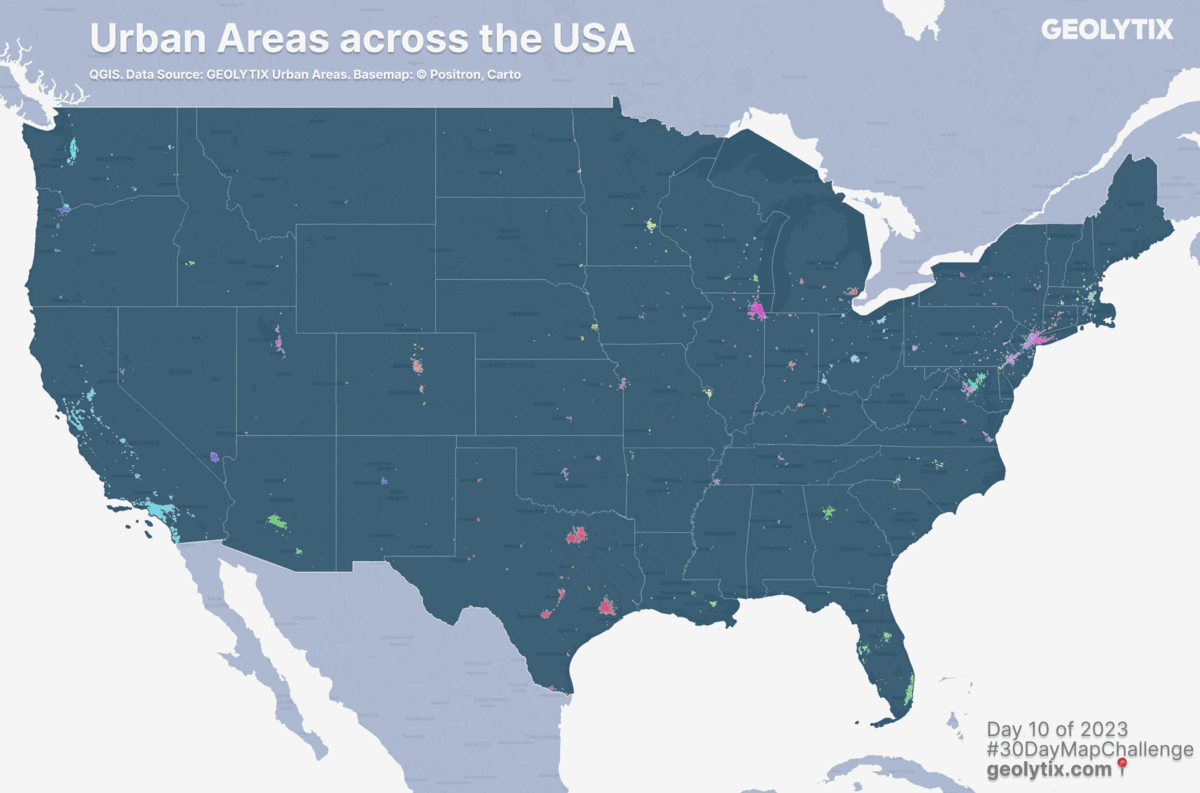
📅 Day 10: North America by Imogen Francis
Urban Areas across the USA > Urban Areas in New York > Retail Places in NYC
Imogen mapped our Urban Area boundaries of which we have over 1,200 across the USA. Within our New York urban area we have 17 sub areas. Overlayed on top of those are our Retail Place boundaries and locations of some major retail brands. An ideal starter pack for all those location planning based decisions.
💡Our global urban areas have been created to define the boundaries of all towns and cities with population thresholds specific to each country. We define the threshold using local knowledge as well as the overall size of the country, settlement patterns, and its affluence. The boundaries are defined by the extent of heavily populated areas, so provide a more accurate extent of towns than traditionally used administrative geographies.
💡Our Retail Places have existed for the UK for over 10 years, we find them invaluable for location planning so over the last 5 years we have created them (and continue to) for many other countries. Retail Places identify opportunity locations for expansion, optimisation and consolidation of stores and assets. Profiling, segmenting and scoring supports finding optimum locations and understanding activity.
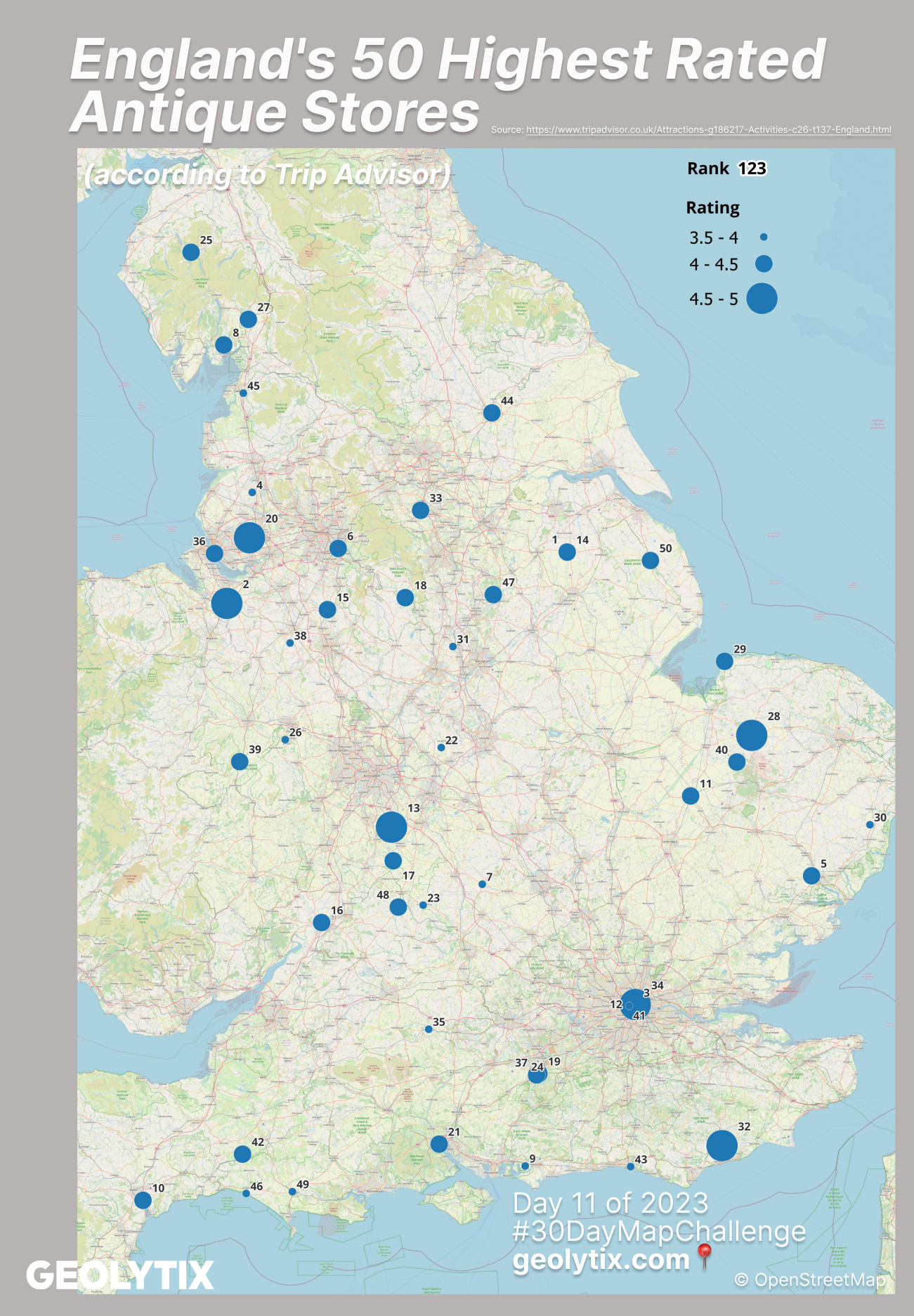
📅 Day 11: Retro by Chloe Smith
England's 50 Highest Rated Antique Stores (according to Trip Advisor)
A blast from the past thanks to Chloe who mapped England's 50 highest rated antique stores according to Tripadvisor.
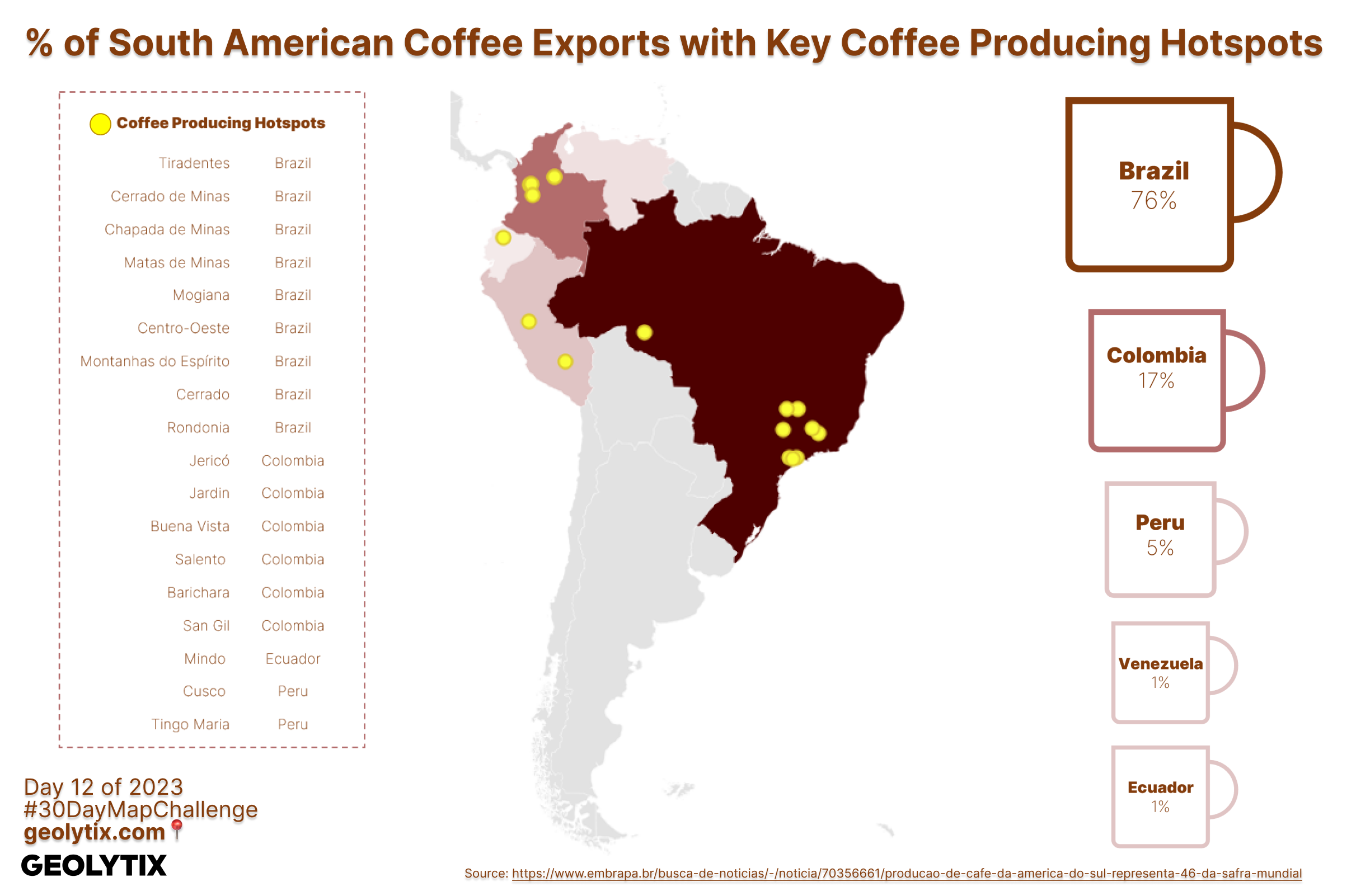
📅 Day 12: South America by Lizzie Dawson
% of South American Coffee Exports with Key Coffee Producing Hotspots
Lizzie mapped the key coffee producing hotspots in South America, Brazil coming out top by far!
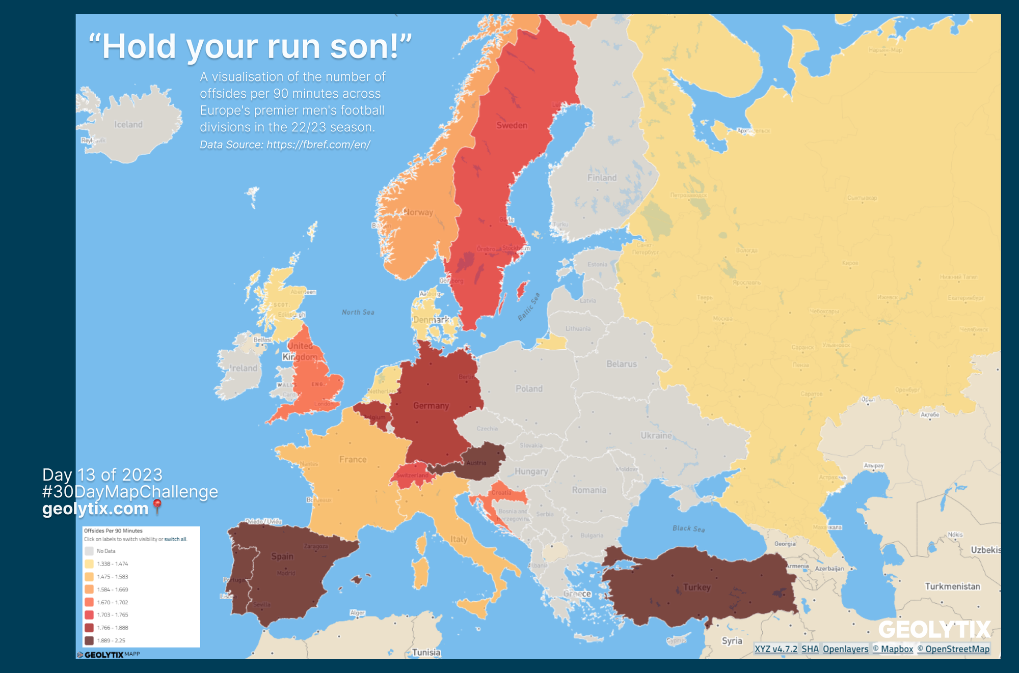
📅 Day 13: Choropleth by Will Johnson
"Hold your run son!" - A visualisation of the number of offsides per 90 minutes across Europe's premier men's football divisions in the 22/23 season.
Which nation succumbs most to the offside trap? - Is it a testament to the audacity of youthful forwards or a tribute to well-drilled defensive structures? While this map offers a tidy European overview, it merely hints at the intricate chess game on the field. In the meantime, stay vigilant and keep your eyes peeled for the fluttering flag - Will Johnson
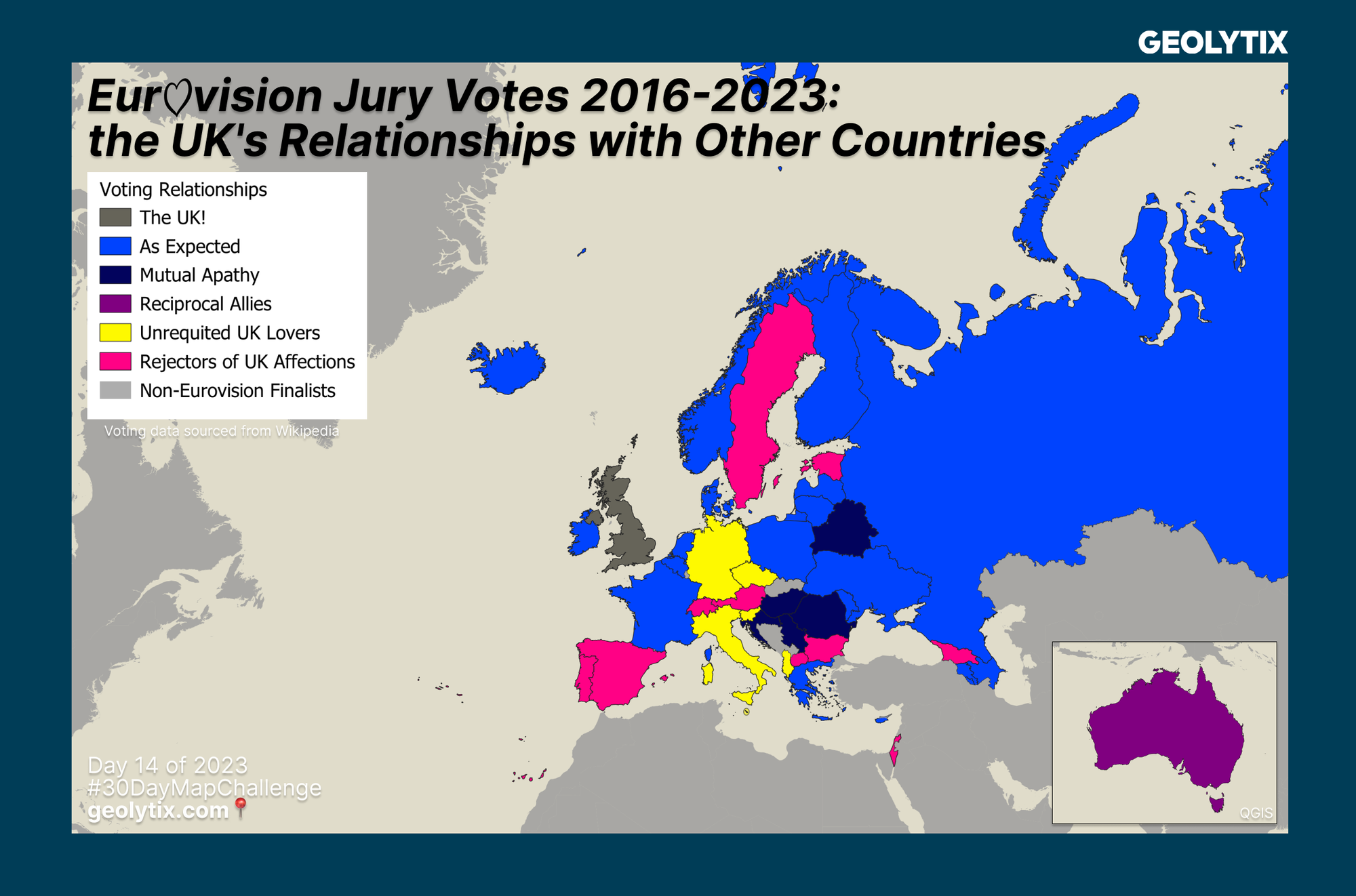
📅 Day 14: Europe by Jessica Ebner-Statt
Eurovision Jury Votes 2016-2023: the UK's Relationships with Other Countries
It's no secret we have a few Eurovision fans within the team, one of our latest recruits joins them. 🎤 We think Jess has perfectly captured the voting relationships felt by the UK.
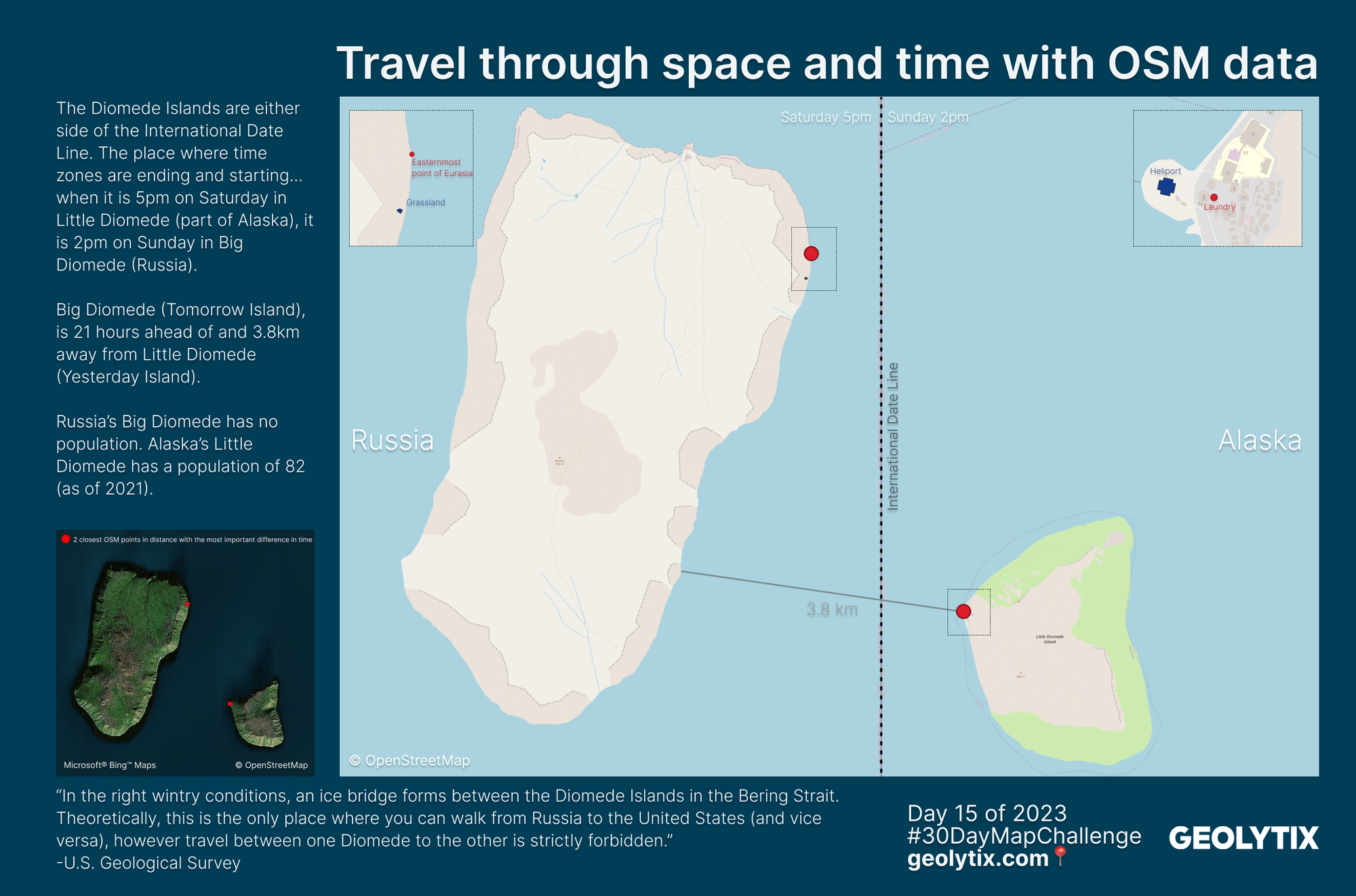
📅 Day 15: OpenStreetMap by Stéphane Martis
Travel through space and time with OSM data
Stéphane used OSM to locate The Diomede Islands, ever heard of them? The place where time zones start and end. Stephane found the 2 closest OSM points which although they are only a few kilometres apart there is actually 21 hours between them.
Nicknamed Tomorrow Island (Big Diomede on the left which is part of Russia) has the most easterly OSM point as a tourist point, 'Easternmost point of Eurasia'. Cleverly nicknamed Yesterday Island (Little Diomede on the right which is part of the US) most westerly point is a Laundrette. Couldn't resist looking at the OSM polys too and you get grassland and a Heliport.
OSM is a fantastic resource! We are very grateful for it and everyone who contributes - thank you. So many amazing things to be shared about it.
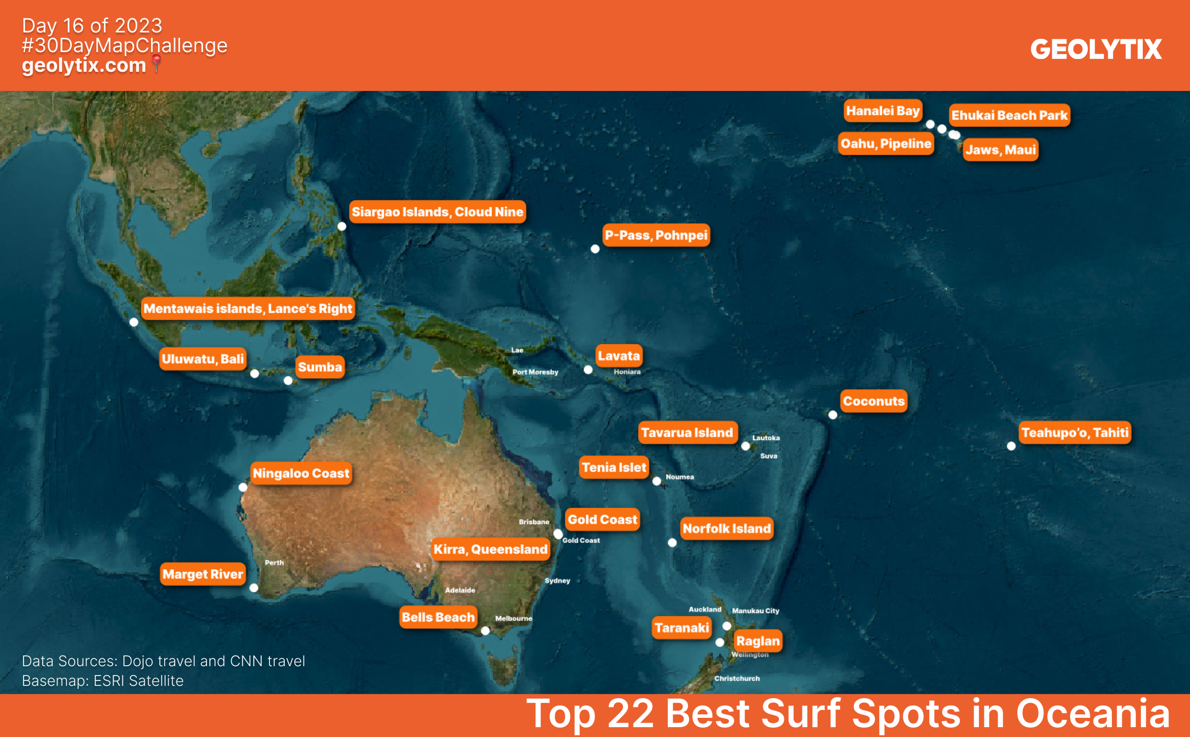
📅 Day 16: Oceania by Sonia Traore
Top 22 Best Surf Spots in Oceania
Sonia putting us in the mood for a summer holiday! Top 22 best surf spots in Oceania, have you visited or surfed any?
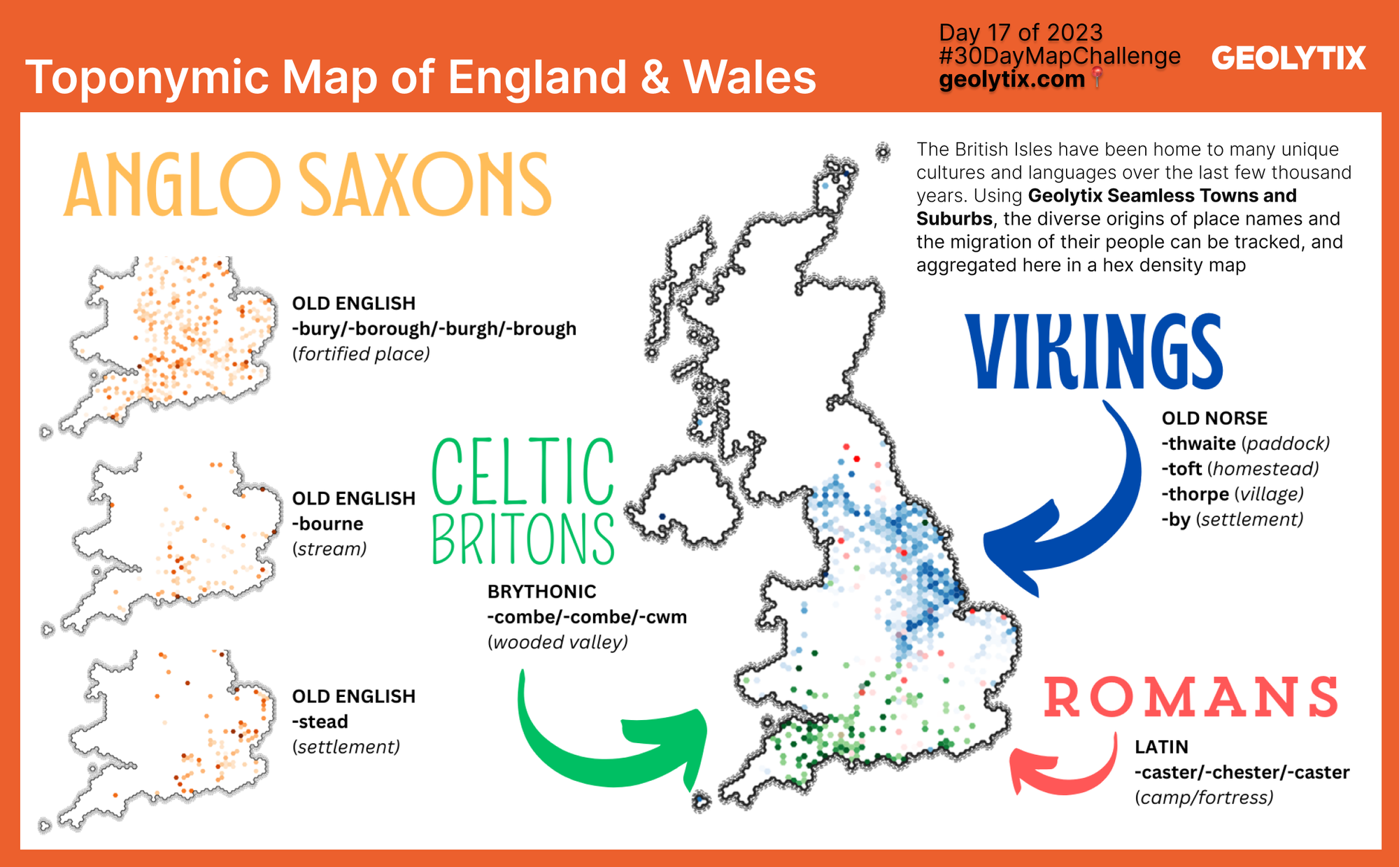
📅 Day 17: Flow by Josh Reynolds
Toponymic Map of England & Wales
We learnt so many interesting things every day with this challenge from the brilliant topics the team came up with for each theme and Josh certainly doesn't disappoint with this one! Toponymic map of England & Wales using our very own Seamless Towns and Suburbs data set.
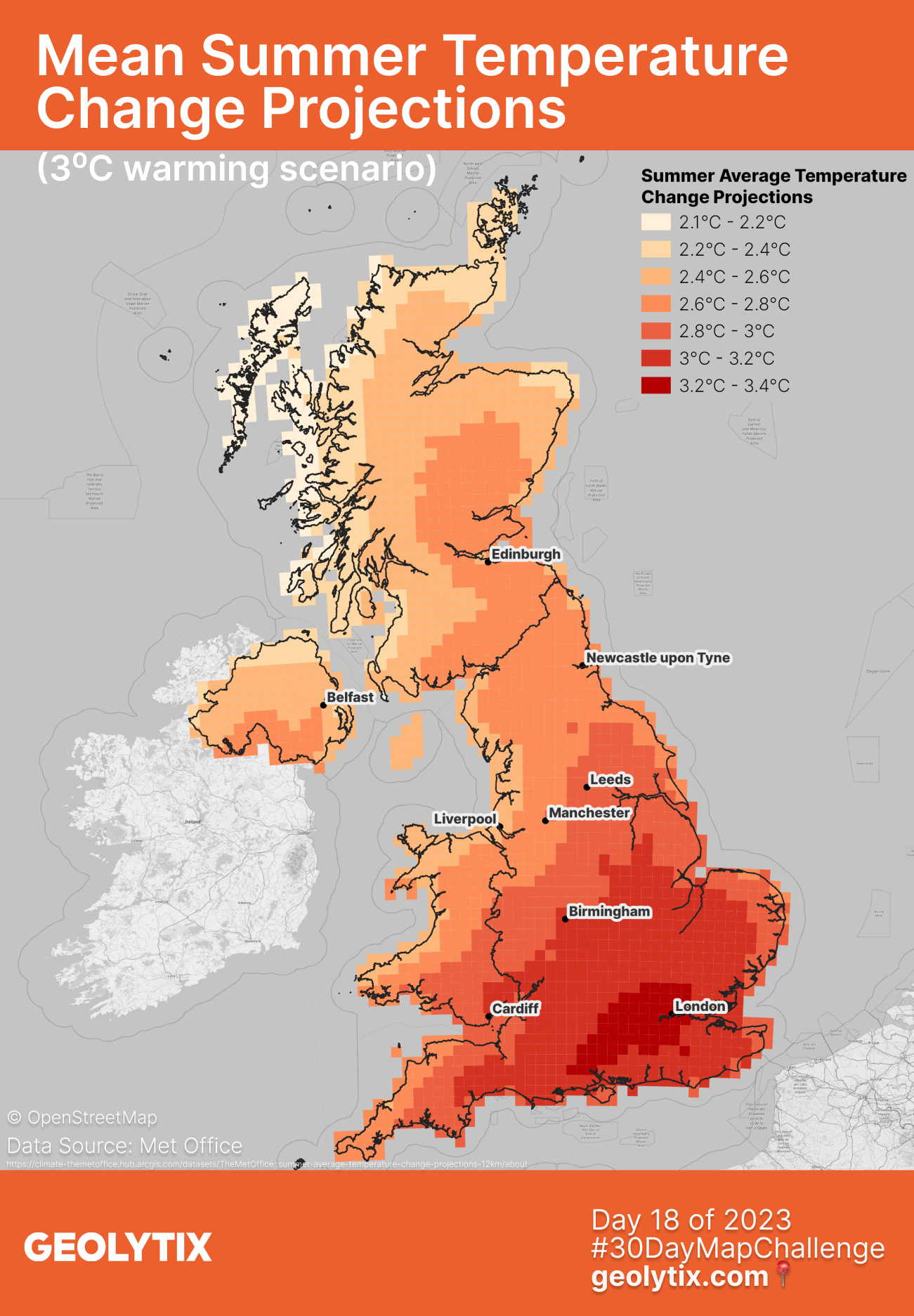
📅 Day 18: Atmosphere by Rachel Wyles
Mean Summer Temperature Change Projections (3⁰C warming scenario)
Rachel used the Met Office data turn up the heat on the UK, but it's not a good thing. Summer temperature change projections with the South being impacted the most. °C change relative to a 1981-2000 baseline using 3°C warming scenario on a 12km grid.
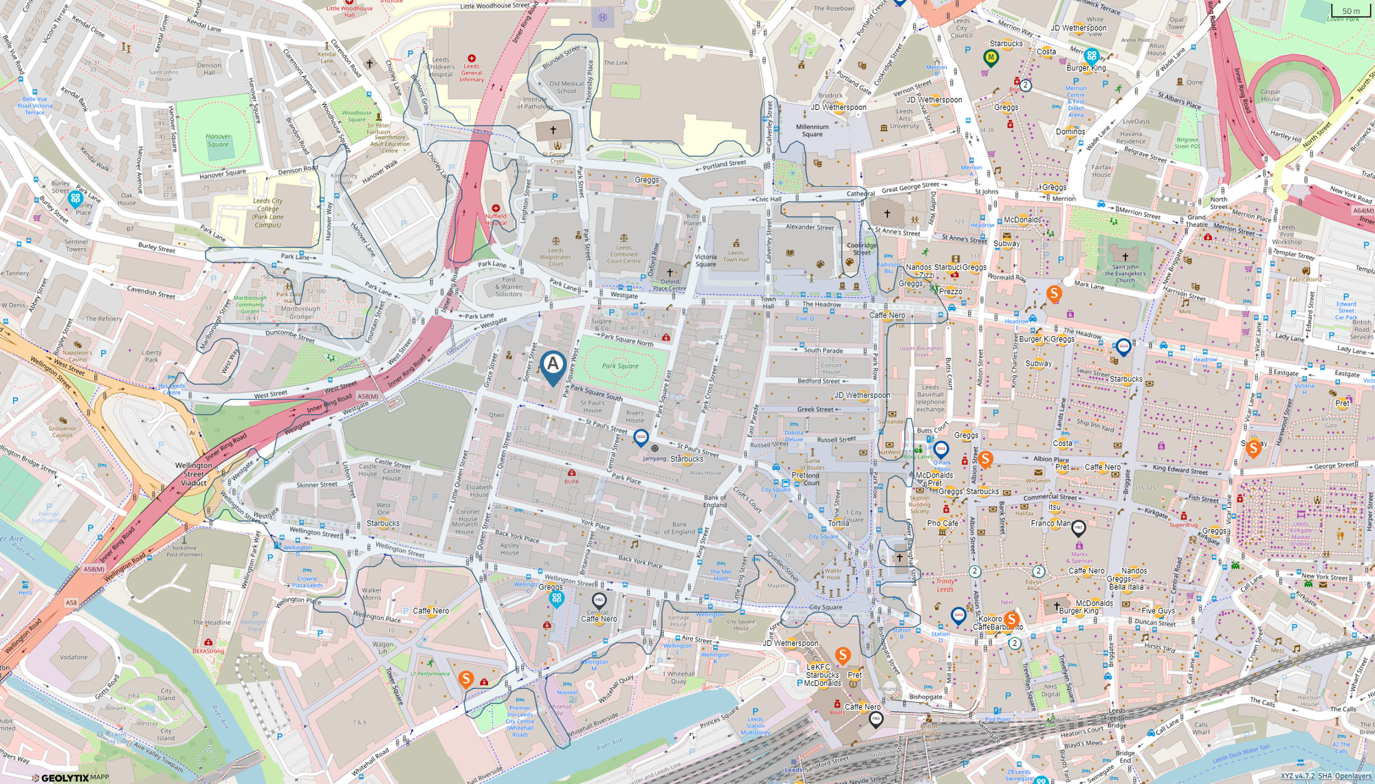
📅 Day 19: 5-minute map by Simon Leech
Simon knows there's no better tool for a quick map than GEOLYTIX MAPP
1 - Search for our Leeds office (Park Square)
2 - Run a 10 minute walk time isochrone
3 - Turn on grocery locations
4 - Label food & beverage in our Retail Universe data
5 - So many lunch options for tomorrow! 😀
Tesco meal deal? Greggs pasty? Pret soup? Tortilla burrito?
All in less than 40 seconds... it'll take him longer to decide where to actually go!
We spy 3 Caffè Nero within a 10 minute walk from the office, ideal to make use of our weekly Vitality vouchers!
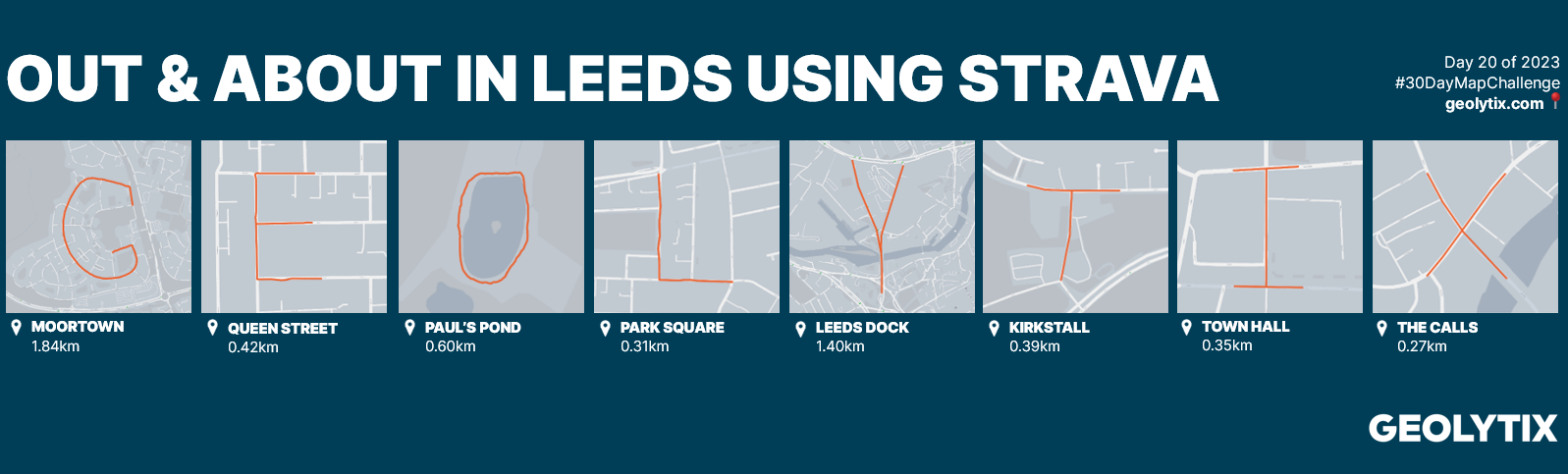
📅 Day 20: Outdoors by Rebecca Mellor and Aimee Thomason
Out and About in Leeds using Strava
The highly anticipated sequel to last years pasta regions of Italy, Becca & Aimee have created another corker! This time they have been out and about in Leeds on walks to spell out GEOLYTIX... we love it!
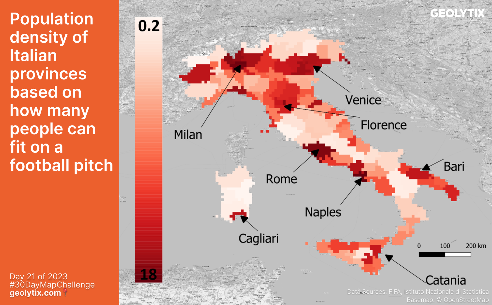
📅 Day 21: Raster by Owen Hibbert
Population density of Italian provinces based on how many people can fit on a football pitch
We always love the football themes and what better country than Italy with its boot shape looking like its kicking a ball. Owen mapped population density of Italian provinces based on how many people can fit on a football pitch.
Owen Hibbert: "It's about accessible metrics, as a population density figure is not always helpful, so by displaying it in terms of football pitches, people can begin to understand how dense a place is!"
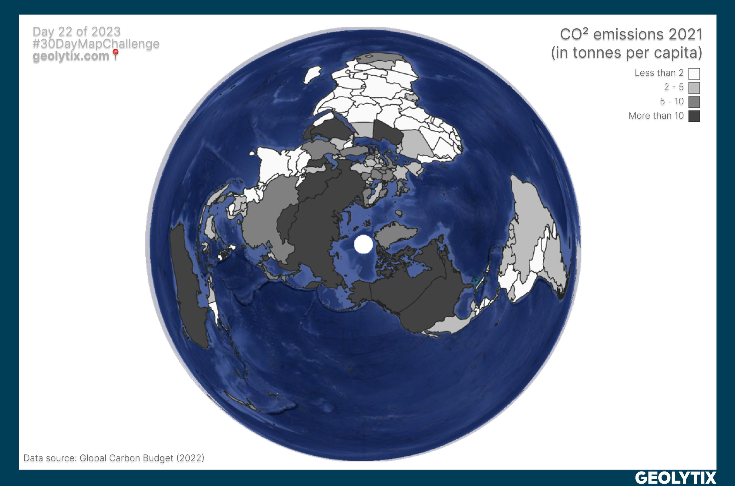
📅 Day 22: North is not always up by Stéphane Martis
CO² emissions 2021 (in tonnes per capita)
No, North is not always up! The usual representation of the World is only a choice of cartographic projection. Stéphane gives us a view of the world using Azyimuthal Equal Area projection, the North Pole is now located in the centre of the map.
Northern countries are used to being on top of the world map but with China, United States, Europe and Russia representing more than half of world’s CO² emissions they are also on top of this metric. According to Global Carbon Budget data for 2021, if we relate CO² emissions to the number of inhabitants, we can clearly see an over-representation of Northern countries. Top of the rankings we find Qatar (around 35 tonnes per capita in 2021) and amongst countries with more than 20 million inhabitants, we also find Saudi Arabian (18.7 tonnes) & Australia (with around 15 tonnes per capita).
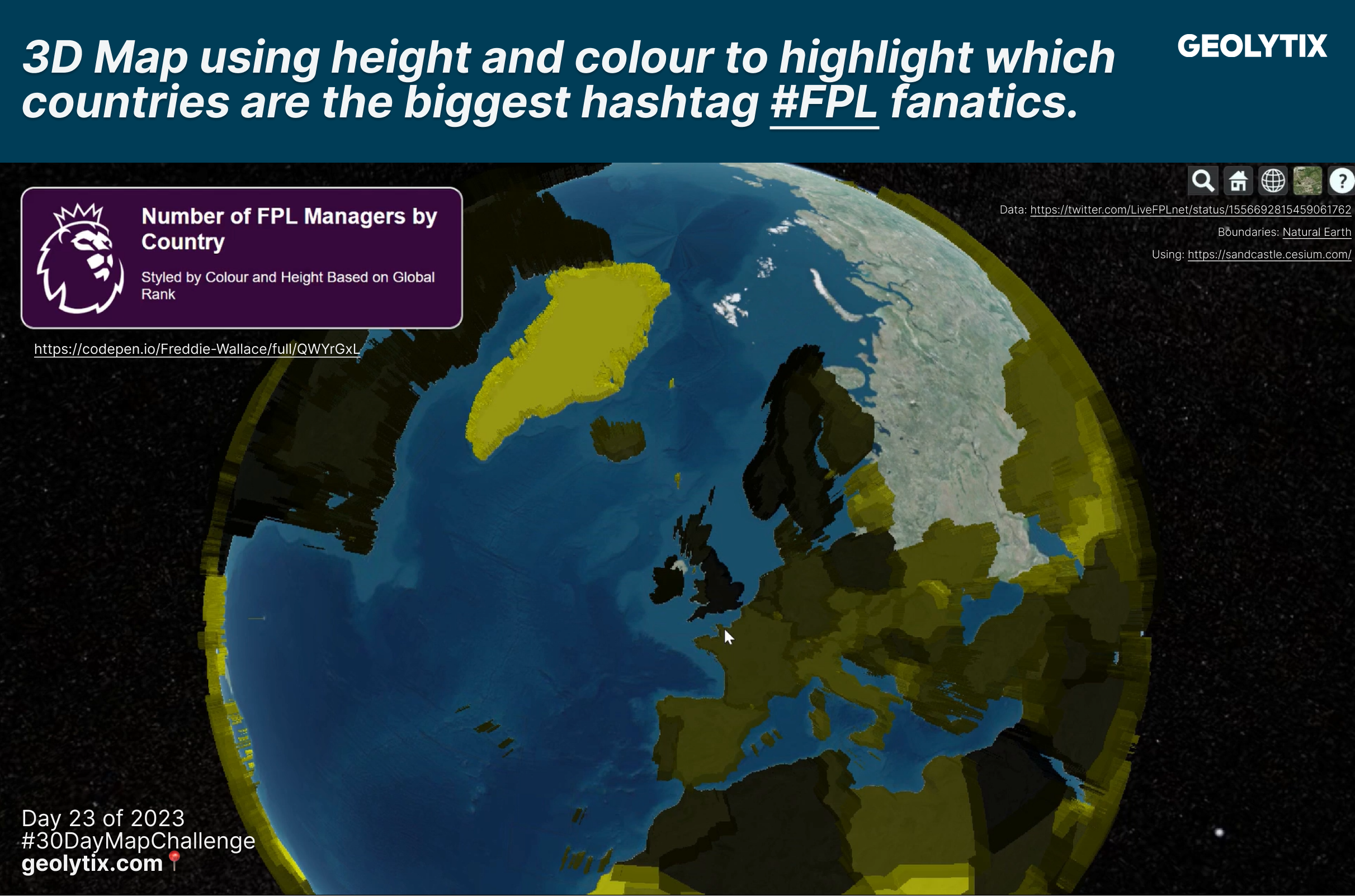
📅 Day 23: 3D by Freddie Wallace
3D Map using height and colour to highlight which countries are the biggest hashtag #FPL fanatics.
With the GEOLYTIX Bundesliga heating up and reaching 18 members this season Freddie decided to check out how many managers are putting their football brains to the test globally.
Using data from @LiveFPLnet and joined to boundaries from Natural Earth, Freddie made use of Cesium to create a 3D Map using height and colour to highlight which countries are the biggest #FPL fanatics. Freddie’s codepen here.
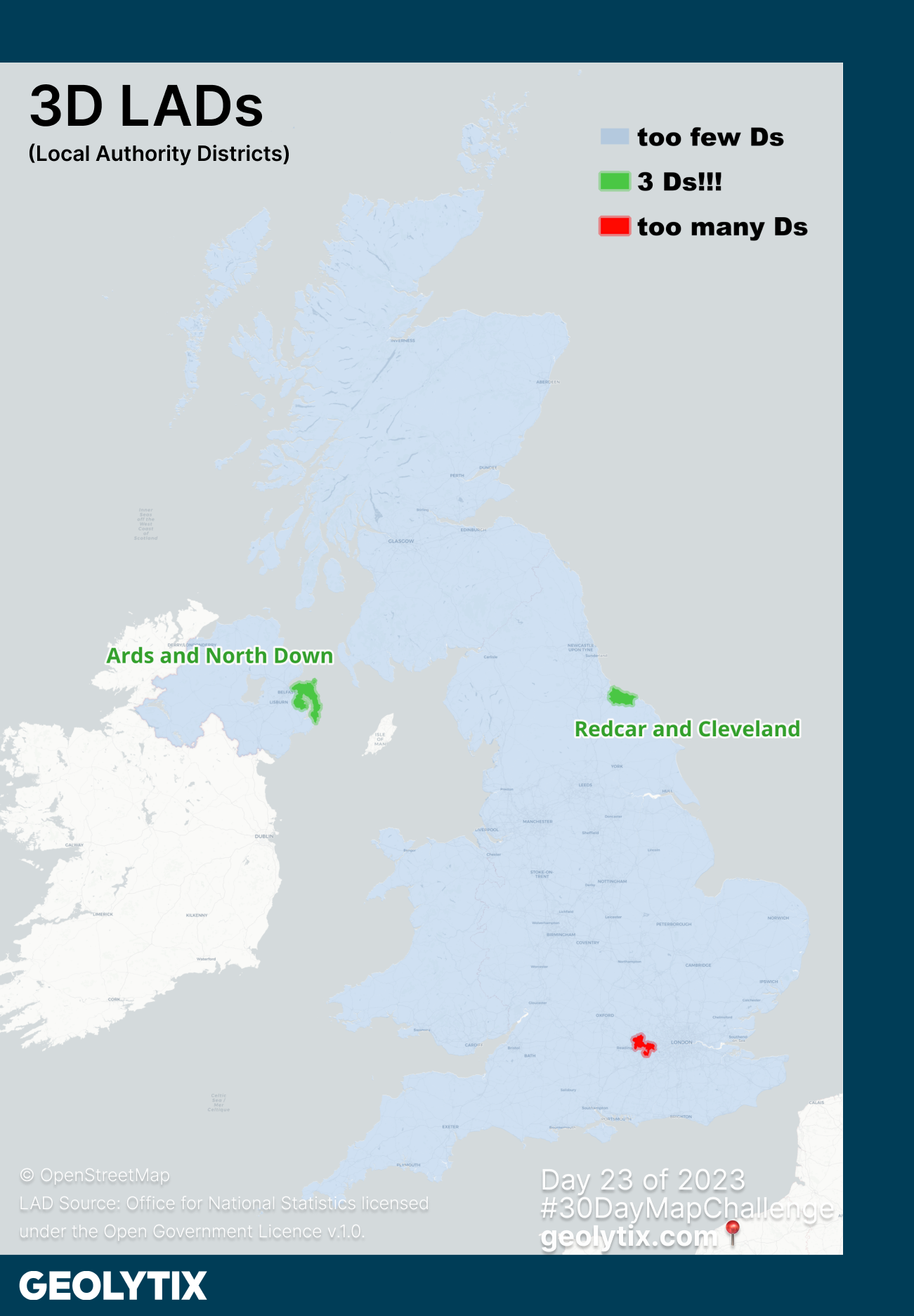
📅 Day 23: 3D by Christoph Mülligann
3D LADs (Local Authority Districts)
Our second map for this theme, a bonus map from Christoph we thought too good not to share. Give yourself a gold star if you can name the too many ds local authority district...
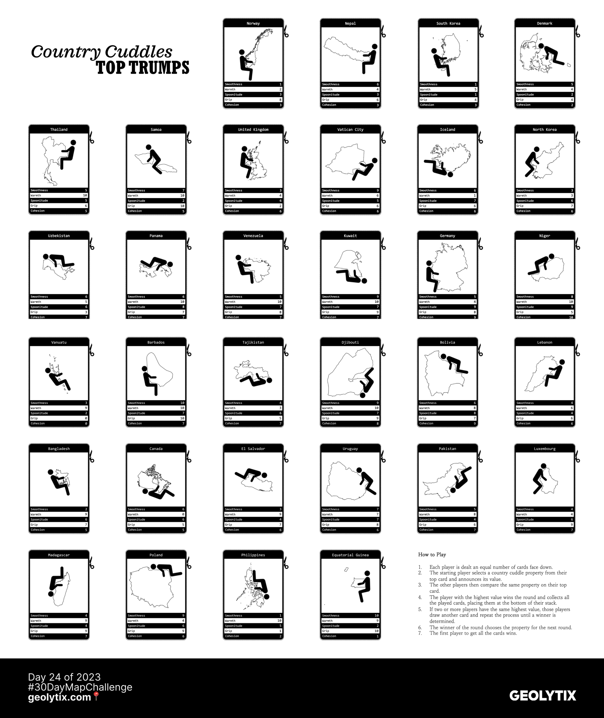
📅 Day 24: Black & White by Christoph Mülligann
Country Cuddle Top Trumps
Christoph never disappoints! The top trumps you never knew you needed... country cuddles. Rated on 5 criteria (smoothness, warmth, spoonitude, grip, cohesion) and hours of fun to be had.
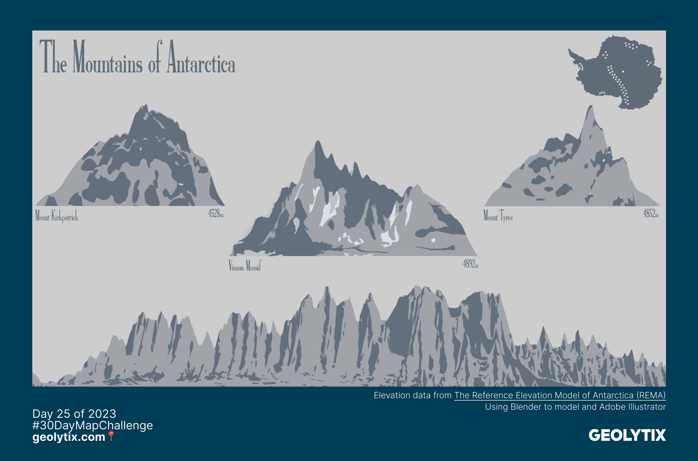
📅 Day 25: Antartica by Callum Scoby
The Mountains of Antarctica
Mountains of Antarctica using data from REMA, Blender to model and Adobe Illustrator to style. We think Callum not only chose a brilliant topic for the theme but produced some beautiful artwork!
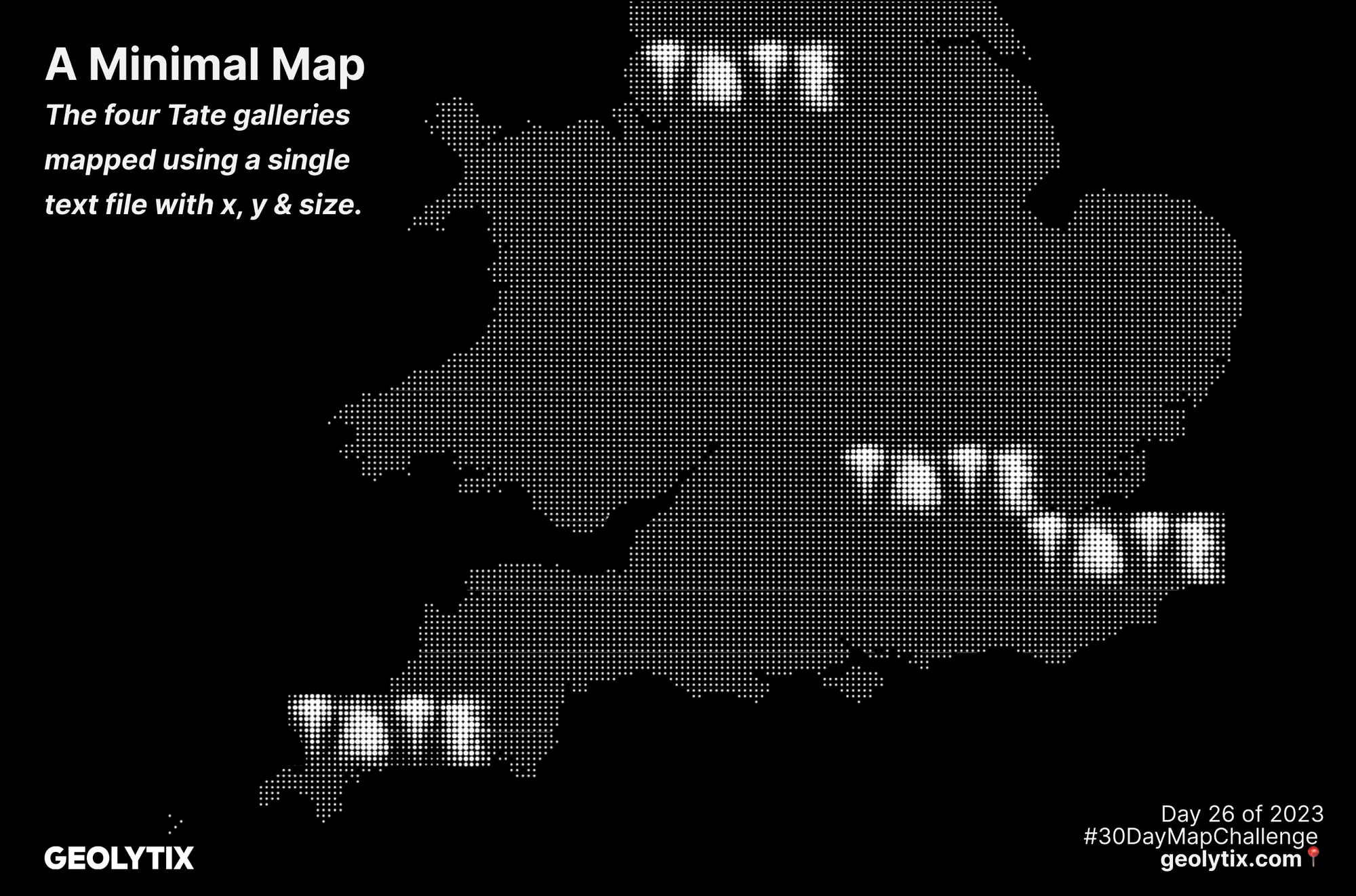
📅 Day 26: Minimal by Blair Freebairn
The four Tate galleries mapped using a single text file with x, y & size
A minimal map of the four Tate art gallery locations.
Tate Britain, Tate Modern, Tate Liverpool and Tate St Ives in Cornwall.
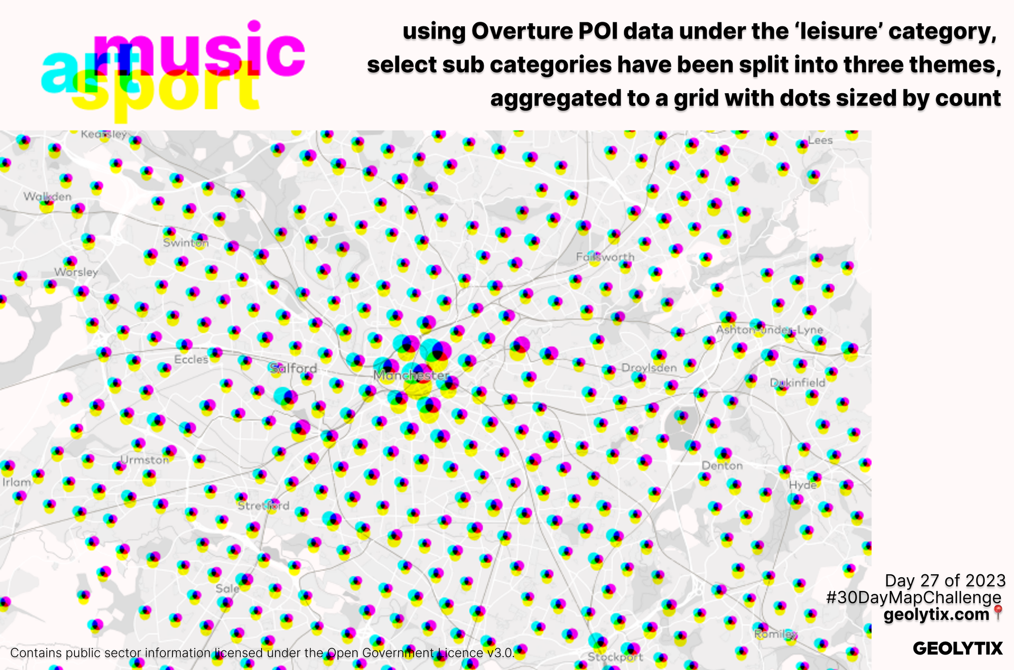
📅 Day 27: Dot by Chris Storey
Using Overture POI data under the ‘leisure’ category
Chris: "We've been really interested in the recent updates to the Overture dataset and it is a great resource for a challenge like this! For the dot theme we took a selection of POI data categorised as Leisure, then chose some select sub categories under three themes: art, music, sport. When aggregated to a grid we counted each type. Then we got 'dotty' with the theme, by offsetting each point symbol, the size of which represents the sum of the POIs, and an overlaying colour theme based on a printer's CMYK colour system. A lot of fun to pull together!"
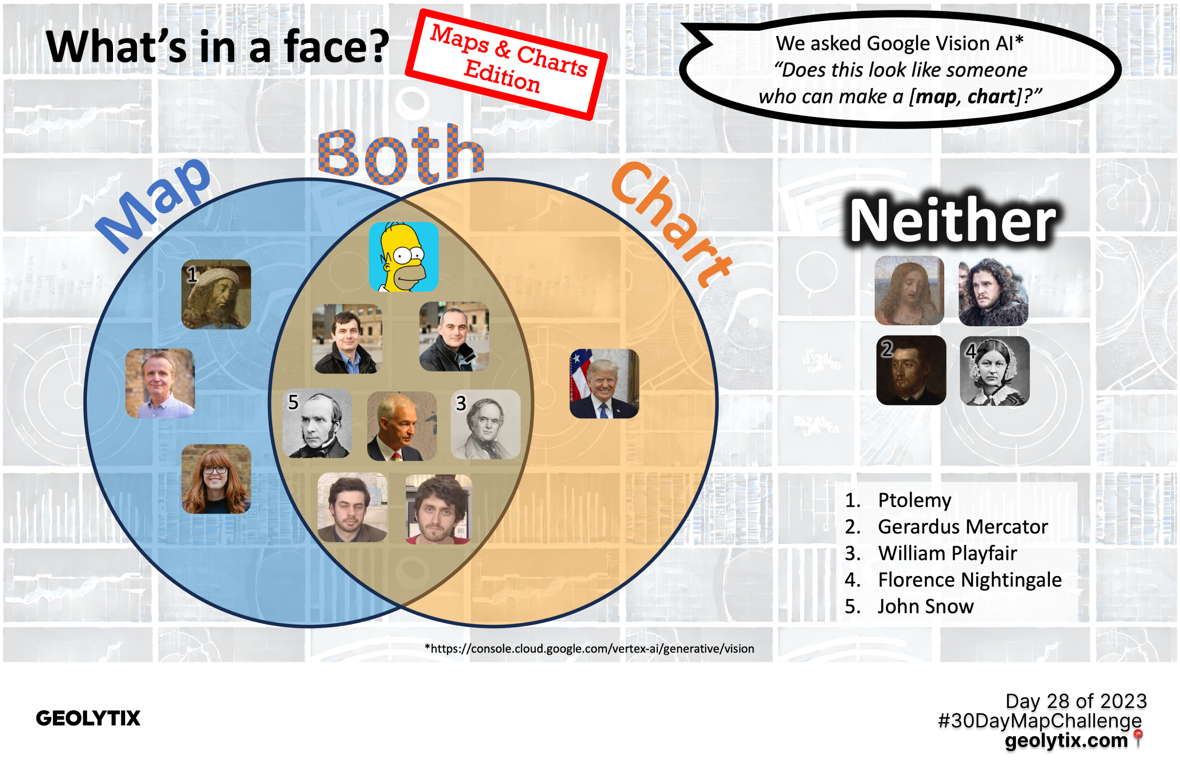
📅 Day 28: Is this a chart or a map? by Christoph Mülligann
What's in a face?
Christoph for the hat-trick threw some faces at Google Vision AI and asked
"Does this look like someone who can make a [map, chart]?"
The faces are a mix of chart and map inventors, Geolytix founding directors and then some others just for fun.
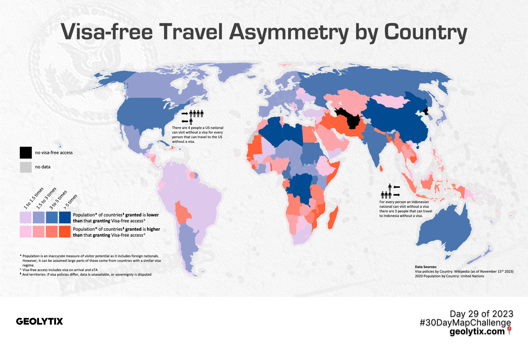
📅 Day 29: Population by Christoph Mülligann
Visa-free Travel Asymmetry by Country
On the topic of population, a map on who you can visit vis-à-vis who can visit you.
Christoph went one better than a hat-trick and wins the award for most contributions 🏆
📅 Day 30: "My favourite..." by Max Laing
...holiday destination
A brilliant theme to end on for the final day. Max Laing asked the Geolytix lot where their favourite holiday destination is.
From hugging sloths in Brazil, hiking the Rocky Mountains in Colorado, appreciating the glaciers of Iceland, sunning in the Whitsundays, soaking up the art in Naoshima to scooting round Tuscany, enjoying cricket in India, cheering on the tennis in Nice, road tripping in New Zealand and safari experiences in Tanzania & South Africa, plus the rest! We certainly have some well travelled talent in the company. New York was the top favourite city with both Kieron and Chloe choosing it and USA, Greece and Portugal coming out top favourite countries from the team. You can view all the destinations and some holiday snaps in GEOLYTIX MAPP.
We really enjoy contributing to this as a team and hope you enjoy looking through them. It's a bit of fun, an opportunity to get creative and indulge in one of the things that unites us in the geospatial world, maps.
Freddie Wallace: "November the most wonderful time of the year! Moustaches and Maps ⭐⭐⭐⭐⭐"

Related Posts
-
Fast Food in Reading - A National Benchmark?
Using Geolytix Retail Universe, Josh maps the UK’s fastest-changing QSR hotspots and where the next wave of growth may emerge.
Published 23rd June 2026 • Tags market-visits, geodata
-

Grocery Growth: UK Supermarket and Convenience Changes in 2026 Q1
Convenience-led growth and selective closures have defined the UK grocery sector in the first quarter of 2026, as retailers continue to reshape their store networks.
Published 30th April 2026 • Tags open-data, geodata
-

Beyond footfall: where retailers really outperform in London
Card spend data reveals where London retailers actually outperform their own estates. From high-conversion rail hubs to high-productivity retail parks, discover the locations driving real growth.
Published 16th February 2026 • Tags geodata